Puzzle branding
Learn how to customize the visual appearance of your puzzles to match your brand.
Introduction
PuzzleMe's branding gives you the flexibility to match your publication's visual identity, maintain a cohesive look, and, when needed, highlight special events or sponsors.
Our branding options let you customize fonts, colors, layouts, and visual elements so your puzzles feel like a natural extension of your site. You can apply branding to an entire series for a consistent look or tailor it for individual puzzles.
What branding does
Branding controls the visual appearance of your puzzles, including fonts for text styling, colors for backgrounds and interactive elements, grid design for borders and cells, and print layout for title position and masthead images.
You can apply branding at two levels:
- Series branding applies to all puzzles of a specific type within a series—perfect for maintaining consistent branding across daily or weekly puzzles.
- Individual puzzle branding overrides series branding for specific puzzles and is useful for special events, sponsors, or unique publications.
Branding is applied in the following order:
- It first looks for Individual branding.
- If that's not set, it uses Series branding.
- If neither exists, it defaults to the default PuzzleMe theme.
Getting started
Series branding
Apply consistent branding to all puzzles in a series. Perfect for maintaining your publication's look across daily or weekly puzzles.
If several series should share the same puzzle content but each series needs different series-level branding (or messaging and embeds), a content set is the usual approach. It is configured on the PuzzleMe side—contact us if that matches your setup.

How to use Series Branding:
- From your dashboard, choose the series you want to brand.
- Click the Branding icon in the series controls section (top of the page).
- If your series has more than one puzzle type, a popup will appear asking you to choose the game type you'd like to brand. Select the puzzle type you want to apply branding to.
- Adjust your settings for fonts, colors, and more using the controls on the right.
- Watch your changes update in real-time on the preview puzzle.
- Use the Reset button to start over, or Save when you're satisfied.
Your branding changes will update the look and feel of all games of this puzzle type in the series after saving.
These settings can be overridden by Individual puzzle branding.
Consider creating separate series for each puzzle type (e.g., one for all your Crosswords, another for all your Sudokus).
This strategy lets you apply unique branding to each puzzle type. It's also a great way to manage specific series-level settings for each game.
Individual puzzle branding
Customize specific puzzles for special events, sponsors, or unique publications. These settings override series branding when applied.
How to use Individual puzzle branding:
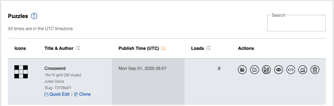
- From your dashboard, find the puzzle you want to customize.
- Click the Branding button (the paintbrush icon) in that puzzle's action row.
- Select the puzzle type you want to preview your branding on.
- Adjust the settings for colors, fonts, and other visual elements using the controls on the right.
- Watch your changes update in real-time on the preview puzzle.
- Use the Reset button to start over, or Save when you're satisfied.
Your branding changes will update the look and feel of this specific puzzle after saving.
Common use cases:
- Special events: Apply unique branding for holidays or anniversaries.
- Sponsored puzzles: Add a sponsor's logo and color scheme.
- A/B testing: Experiment with different looks to see what your audience prefers.
- Unique publications: Give puzzles in different sections of your site a distinct feel.
The branding interface
When you open the branding tool, you'll see a live preview of your puzzle showing how branding changes look in real time, plus all your customization controls organized in panels on the right side.
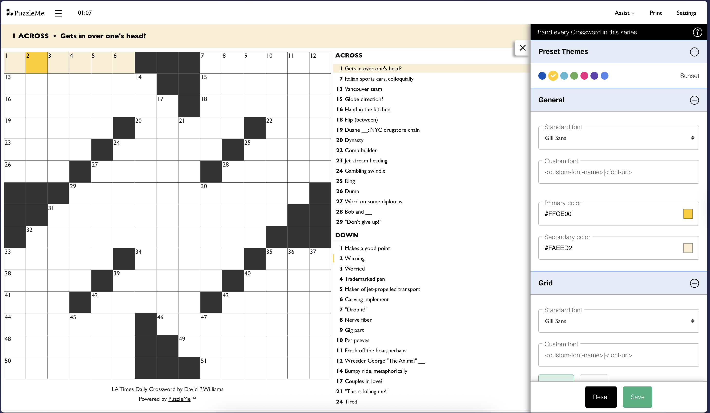
As you adjust settings on the right, you'll see your changes update instantly on the preview puzzle. This lets you experiment with different looks and see exactly how your branding will appear to solvers.
Preset themes
Start with one of 7 preset themes, each with pre-configured colors and fonts. These themes use carefully chosen color palettes and typography that work well together.
Select a theme that matches your brand, then customize any setting to make it uniquely yours.
Here's what each theme includes:
Ink (default)
Sunset
Ocean
Forest
Candy
Grape
Typewriter
Customization options
Fonts
You can choose from over 1,500 Google Fonts for your puzzles. The font you select will be used for all text outside the puzzle grid (clues, buttons, and interface elements).
Use the font selection box to:
- Search by font name
- Filter by language and style (serif, sans-serif, monospace, etc.)
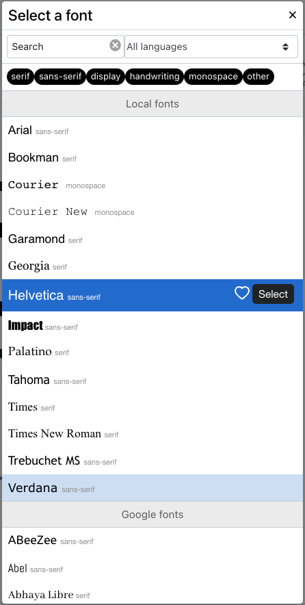
PuzzleMe automatically chooses black or white text for the best contrast with your background colors. All fonts are from the Google Fonts catalog and are licensed for use on your website.
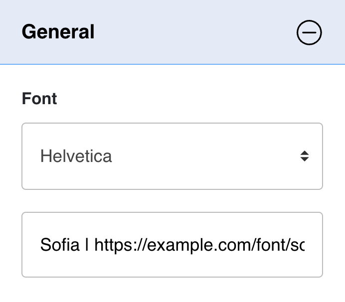
Custom fonts
If your preferred font isn't in the Google Fonts library, you can add your own custom font.
Requirements:
- Font file must be in WOFF2 format
- Font must be hosted on your own server
- Your server must allow the font to be loaded by
amuselabs.com
How to add:
Type the font name and its URL in the font field, separated by a pipe (|).
Example:
Sofia | https://example.com/font/sofia.woff2
- Always use secure
httpslinks for your font files. If you use HTTP links, the fonts will not load. - Only use the font name (e.g.,
Sofia), notSofia, serif.
If you use Adobe Fonts, we can integrate them for you. Feature availability may vary by plan. Please contact us to get started.
Colors
Primary
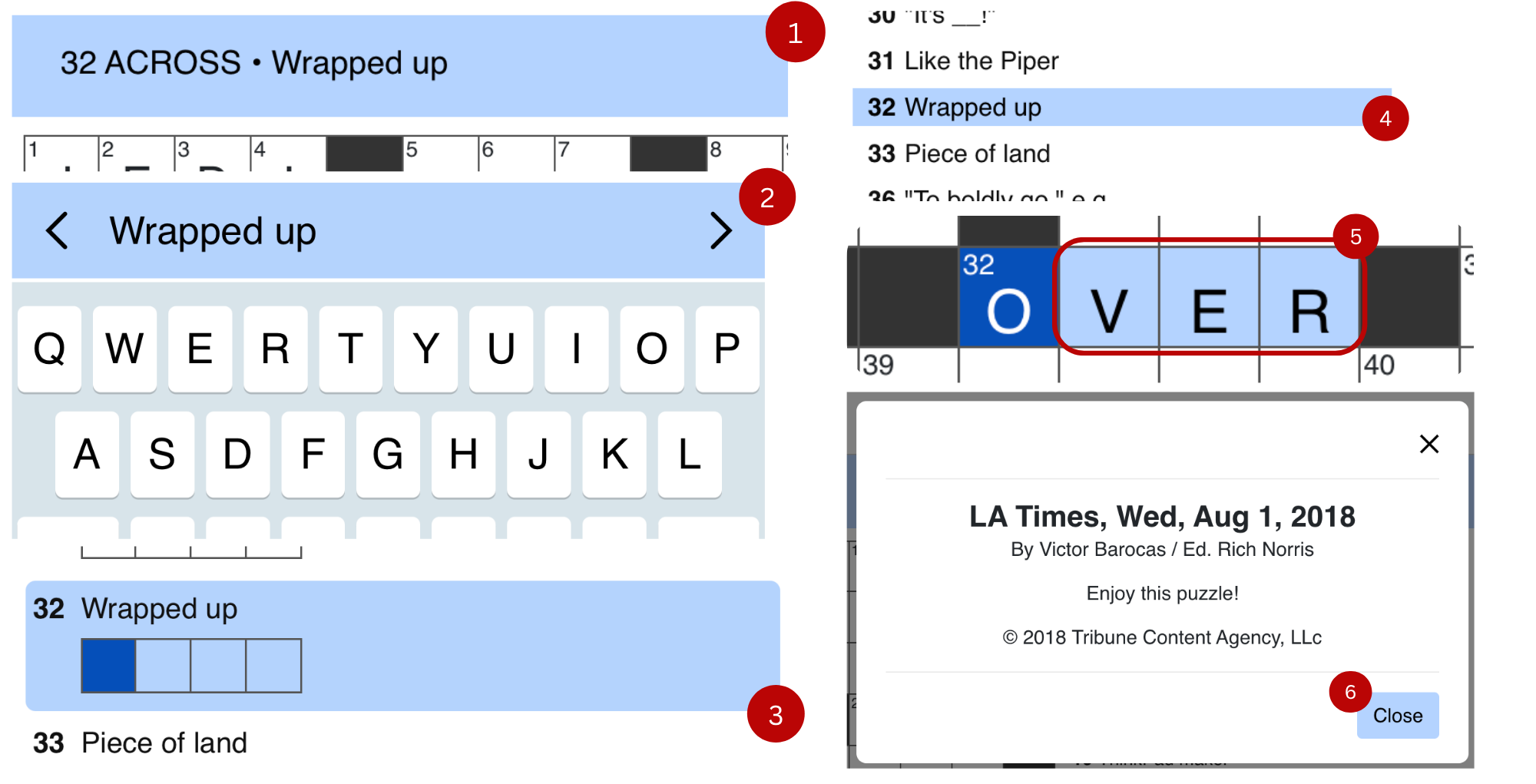
The primary color applies to:
- Dialog box buttons
- The focused cell on the grid
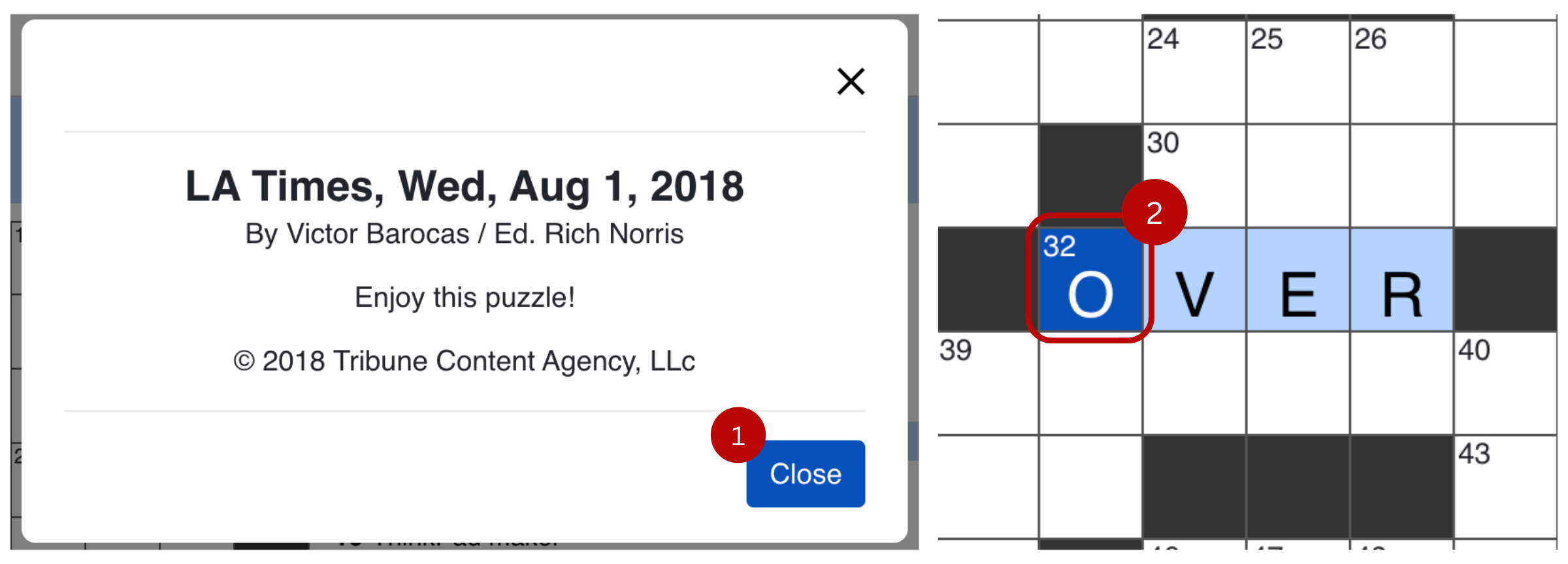
Secondary
The secondary color applies to:
- Clue bar (on desktop and mobile)
- Selected clue (on desktop and mobile)
- Dialog buttons on hover
- Background of the selected word in the grid
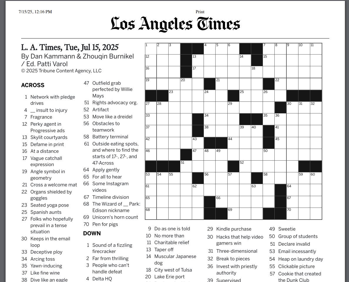
Print customization
Many solvers prefer solving puzzles on paper or saving them as PDF. Print customization options let you control the design of printed puzzles.
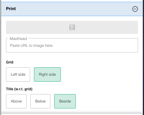
Customizable elements:
- Masthead
- Grid position
- Title position
Masthead
The masthead field accepts an image URL. By default, no image appears at the top of printed puzzles or PDFs. When you specify a masthead image in the branding tool, it appears at the top of the printed page.
You can use your publication or website logo image for the masthead.
- The height available to the masthead is shorter than its width. Thus, please use an image with a wide aspect ratio (where the width is greater than the height). Using a narrow aspect ratio image would squish the logo and display it in a very small size.
- Only SVG, PNG and JPG file formats are supported.
- The preferred file format is SVG, since it helps keep the size of the print PDFs small.
Grid and title position
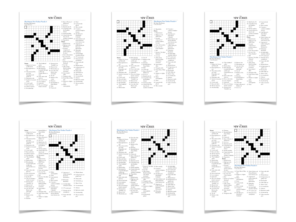
- Crossword
- Word Search
- Codeword
- Kriss Kross
- Sudoku
Grid design
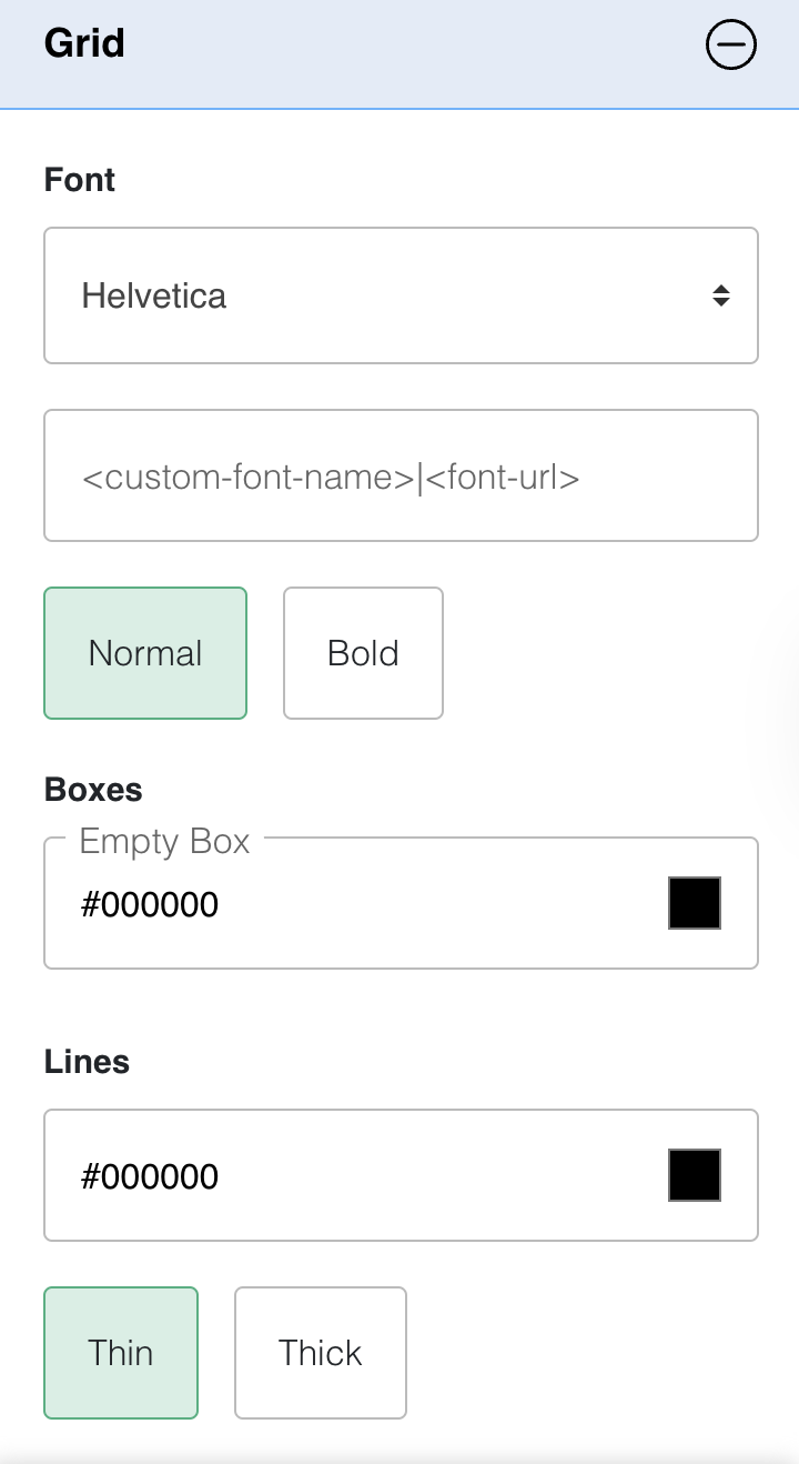
Grid font
The grid font applies to both the letters and the clue numbers in the boxes. Make sure the numbers are legible with the chosen font. You can check if making the font bold helps.
Empty box
Empty boxes (also called block cells) conventionally use a shade of black. You can override this color to create a more unique grid appearance.
Lines
By default, gridlines are drawn in thin style using black. You can change both the color and the thickness of the gridlines.
- Crossword
- Sudoku
- Kriss Kross
- Codeword
- Word Search (only grid font)
Game type specific options
Word flower
Word Flower-specific design options are available under the "Flower" and "Buttons" sections of the series branding tool.
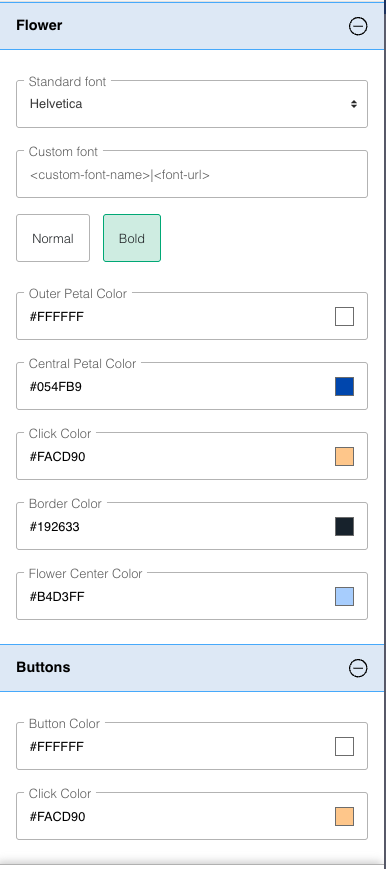
Flower design options
- Letter font controls the font used to show letters inside the Word Flower petals
- Click color appears when solvers click on a petal to enter a letter—the petal's background color momentarily changes to this color
- Border color sets the color of the flower border
- Flower center color fills the empty spaces between the central petal and the outer petals
Button design options
- Button color sets the default background color for the shuffle, backspace, and enter buttons below the flower
- Click color appears when solvers click on a button below the flower—the button's background color momentarily changes to this color
WordroW
WordroW-specific design options are available under the "General" and "Indicator colors" sections of the series branding tool.
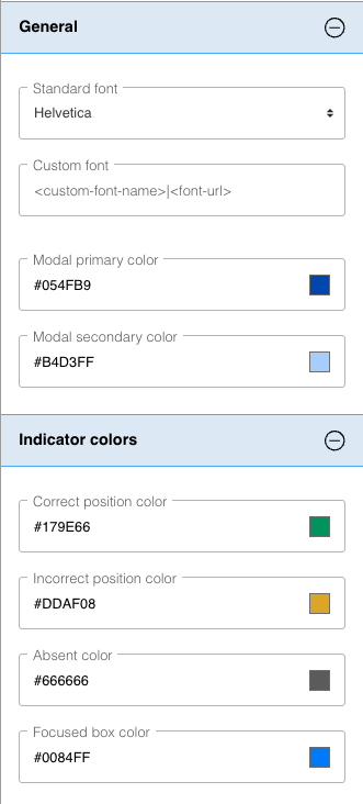
General design options
- Modal color sets the background color of modal headers (popups/dialog boxes)
- Modal button color sets the background color of buttons used in modals (e.g., clear/save)
Indicator color options
Indicator colors appear in the background of grid letters to provide feedback about entry correctness.
- Correct position color is used when the correct letter is entered in the correct position
- Incorrect position color appears when a letter belonging to the word is entered in an incorrect position
- Absent color shows when the entered letter does not belong to the word
- Focus box color highlights the actively selected letter
Quiz
Quiz-specific design options are available under the "General" and "Quiz" sections of the series branding tool.
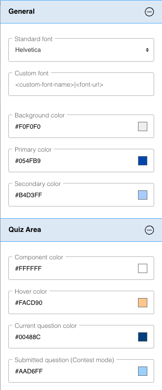
You can customize several background colors for quizzes:
- Component color is used for the question area, options buttons (for multiple choice questions), answer field (for freeform questions), and navigation buttons (Previous, Next)
- Hover color appears when hovering over navigation buttons, question numbers at the top of the quiz, options buttons (for multiple choice questions), and the "Enter" button (for freeform questions)
- Current question color highlights the currently active question number in the question number list at the top of the quiz
- Submitted question color indicates already answered questions in the question number list at the top of the quiz
Best practices
Keep these tips in mind as you customize your branding:
- Choose fonts and colors with good contrast so players can read clues and see the grid clearly
- Test your branding on mobile devices before launching, especially phones where space is limited
- When creating special branding for events, remember to remove or update it once the event is over